Dallas Fort Worth International Airport (DFW):
Optimizing the journeys for travelers en route to their final destinations
The Dallas Fort Worth International Airport (DFW) is a large international airport hub with 900+ daily flights that serve 224 destinations in 30 countries. It is the primary international airport servicing the North Texas Region. All 5 terminals and 160+ gates are accessible via the Skylink Train post-security.
During this 3 week client engagement, we conducted comprehensive research into airport processes, travelers, and DFW passengers to propose a mobile website that seamlessly integrates digital solutions with in-person processes.
Position
UX Designer & Researcher
Client
Timeline
3 Weeks
Tools
Figma, FigJam, Google Forms, Google Sheets
Problem:
With 5 terminals and 160+ gates, Dallas-Fort Worth Airport (DFW) can oftentimes be confusing and inefficient for travelers to navigate quickly. Furthermore, relevant flight and terminal specific information can be difficult to find - thus creating stress and uncertainty for travelers seeking their departure gate or various pre-flight services.
Solution:
To gain a comprehensive understanding of our target users, particularly DFW passengers, we employed diverse research methods across multiple platforms. After defining the users and their needs, we developed a mobile website solution and corresponding documentation that delivers the information they need - when they need it. Our initial prototype underwent testing with actual travelers and DFW flyers, and we incorporated their feedback into iterative improvements. Ultimately, we created a high-fidelity prototype that represents our final solution.





Researching people and processes at DFW Airport (and similar venues)
User Interviews
Screened Questionnaire
Google Reviews Analyses
Comparative Analyses
Research Insights:
34 questionnaire respondents, 23 Google reviews, and 5 interviewees were leveraged for the insights below.
Comparative Insights:
Singapore Changi Airport
Since its establishment in 1981, Changi Airport has been honored with 650+ "Best Airport" awards. Their mobile website serves as a comprehensive resource, offering detailed information about flights and airport services.
Northwestern Med Spa & Patient Portal
While med spas and modern healthcare providers are not direct competitors to DFW Airport, their pre-appointment and queueing processes exhibit similarities that can offer valuable insights applicable to airport processes.
Entertainment Venues (Lyric Opera House, United Center, AMC Theaters)
The process of queuing before a concert or movie also shares similarities with navigating through an airport. Each venue has its own unique practices and factors to consider from arrival to departure. This encompasses various aspects - including documentation, security, and navigation - that necessitate different affordances and allowances.
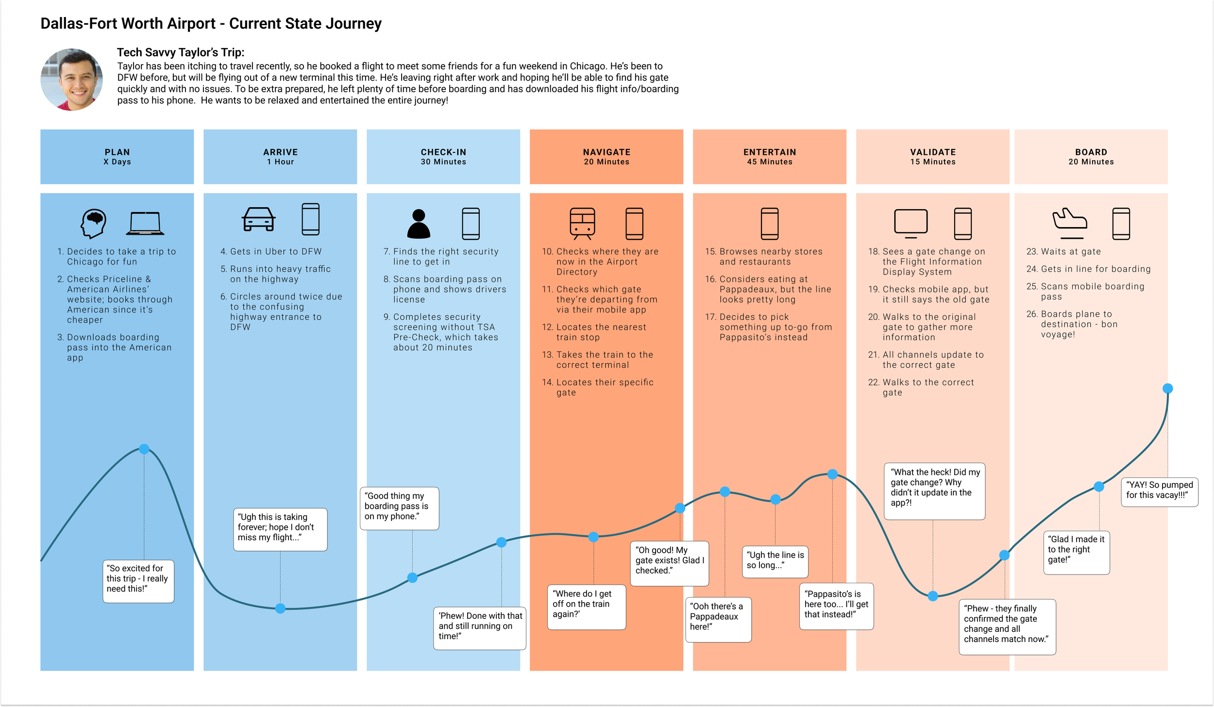
All the aforementioned research and insights were synthesized into a target user persona and current state mapping of the DFW airport experience. This helped us better conceptualize user needs, as well as existing pain points in the journey.
User Insights:
Digital Solution
Sketching
Wireframing
Prototyping
Usability Testing
Navigation & Processes:
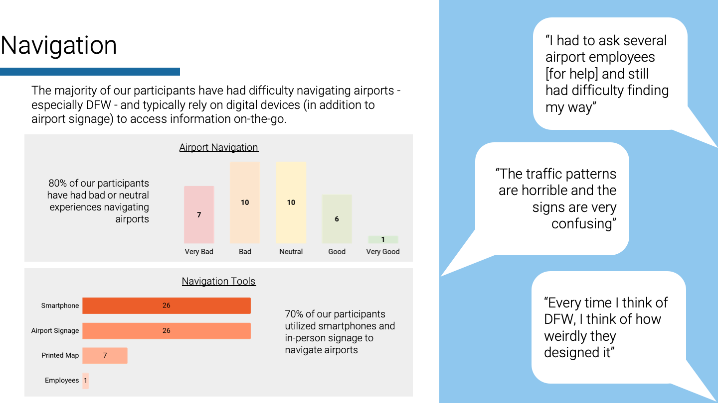
In general, flyers have often faced challenges when it comes to finding their way around airports. Through our research, we validated that our users heavily rely on digital devices to navigate airports. This is why we decided to make a mobile web experience. That way, users have a digital solution, but don’t have to spend time downloading a native app.
Airport Services:
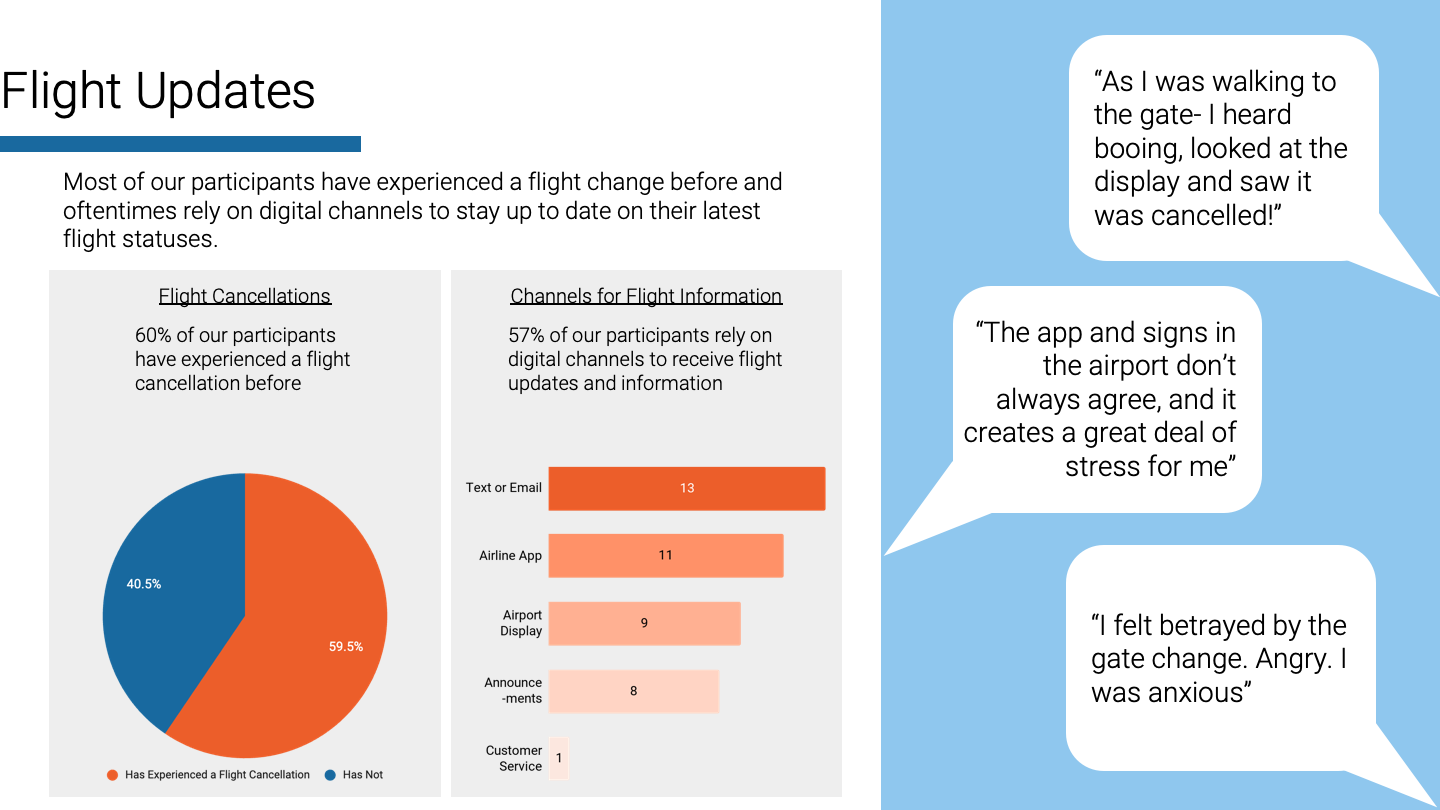
We gathered data indicating that flight cancellations and changes are a common problem, affecting 60% of our participants. Our research also showed that passengers primarily receive updates about flight changes via text/email or an airline app.
To assist users like Taylor in efficiently navigating DFW, we have designed an experience focused on the essential aspects of air travel:
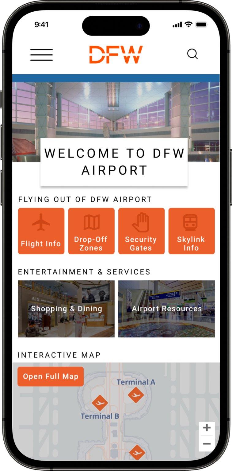
Starting from the homepage, we have placed DFW branded orange elements at the top, representing core airport processes, while different airport services are listed below.
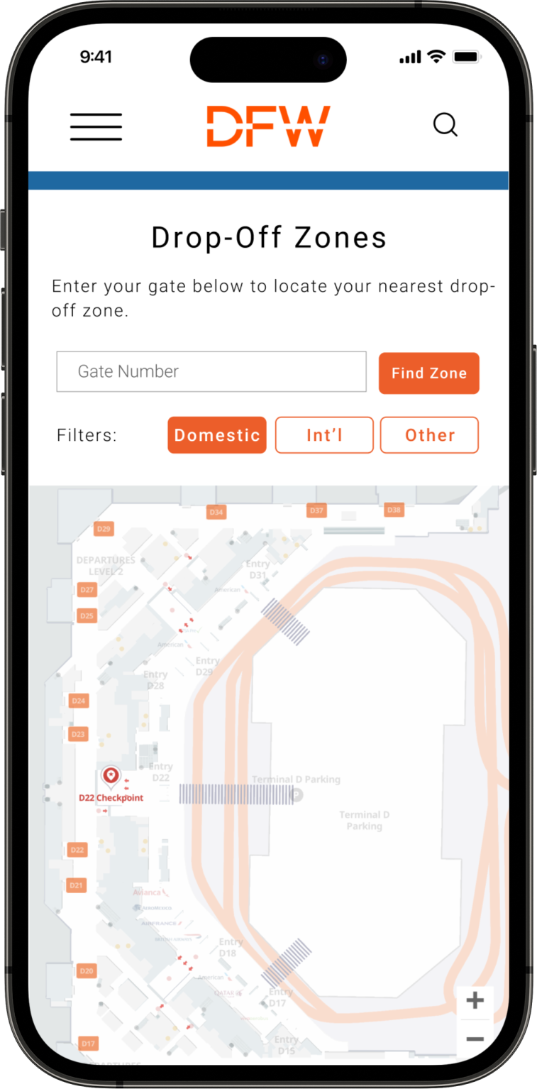
Users like Taylor, who typically arrive at the airport via rideshare or with the help of a friend, can easily find information about their drop-off zone directly from the homepage. Upon entering their gate, they can locate the corresponding drop-off zone.
If users wish to return to the homepage, they can simply click on the DFW logo at the top. Next, their priority is finding the security gate. By clicking on one of the orange buttons, they can navigate to the Security page. Once there, they can select their checkpoint, which will display a live wait time in a modal.
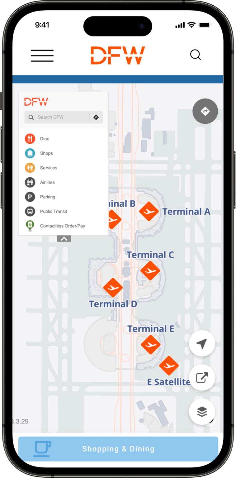
After successfully passing through security, users can access the Skylink map by using the hamburger menu or returning to the homepage. This map will guide them on how to navigate between terminals if necessary.
Flight Updates:
To keep flight and gate information top of mind, this flow is also easily accessible in our website:
To access the most recent gate information, users can begin at the home screen and click on Flight Info. This will allow them to search for their specific flight.
In our prototype, the user's information is conveniently pre-filled, and we can simply click "search" to retrieve the flight details.
Within the flight information section, users will find the updated gate information for their flight displayed under the "gate" category. Additionally, they can access other relevant flight details such as boarding time and the recommended security checkpoint.
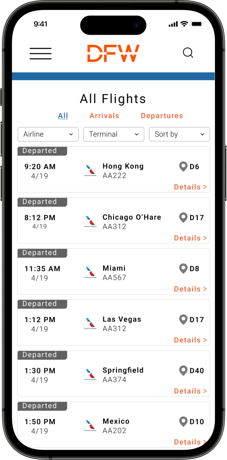
In case users don't have their flight information readily available, they can click on "view all flights" to access a comprehensive list of all available flights. From there, they can utilize the filter options to refine and narrow down the search results according to their preferences.
Based on our research, it became evident that the majority of our users arrive at the airport well ahead of their departure time, and one of their priorities is to find ways to stay entertained during their wait.
To ensure users like Taylor can easily access the information they need and find entertainment options, we have developed this flow focusing on restaurants and services:
Starting from the homepage, users can find a vendor by clicking Shopping & Dining.
One of the features we have implemented is a filtering system that allows users to refine their search results based on their preferences. By examining the labels associated with each restaurant listing, users can quickly determine if a restaurant meets their specific requirements. Furthermore, we provide a link to access more details about each restaurant.
Upon clicking the link for more details, users can find comprehensive information about the restaurant, including a link to their menu and the option for mobile ordering.
By navigating to the Airport Resources section, users can discover other services and resources available at DFW, ensuring they can stay entertained throughout their airport experience.
Corresponding Documentation
Email Campaign
On-Site Signage
Email Campaign:
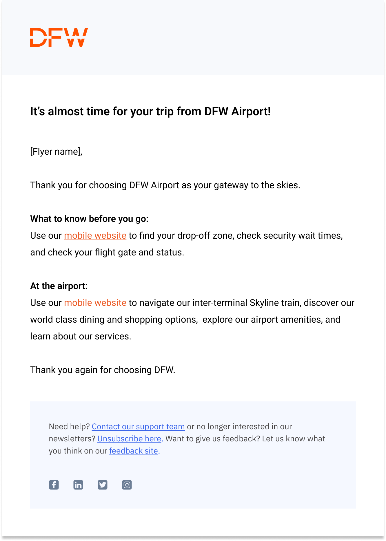
Understanding the need for passengers to easily access their flight information and stay informed, we also developed an email campaign and in-person signage to guide passengers towards our user-friendly mobile website ahead of and during their travel.
In-Person Signage:
Responsive on both desktop and mobile
Sent 24 hours prior to a traveler’s departure from DFW
Placed throughout the journey at:
Lobbies
Security
Walkways
Gates, etc.
So what’s next?
Recommendations
Our Recommendations:
Enhance Accessibility
Our site meets AA accessibility standards, but can be improved in the future to meet AAA standards as well.
Beta Test MVP
After our prototype is re-tested, our MVP should be tested with actual users to evaluate real world function + efficacy.
Dining Wait Time Feature
A highly requested feature was dining wait times - we need to define the technical constraints to build this out.

