Pelican Invests:
Creating an intuitive online fundraising and gifting platform tailored towards education
Pelican is an investment platform that enables families to save and raise funds to support the future education of their children.
During this 3 week client engagement, we worked with Pelican to evaluate their existing experience and improve the intuition and conversion of their core dashboard and flows.
Position
UX Designer & Researcher
Client
Timeline
3 Weeks
Tools
Figma, FigJam, Dovetail
The Ask:
Pelican's asked us to improve the user experience of creating, sharing, and gifting education funds. They sought to explore new features and enhance existing flows to increase user engagement, improve conversion rates, and ensure ease of use. We identified pain points and found seamless and intuitive solutions to address them.
KPIs: increased conversion rate, increased engagement (as measured by funds created, shares, and gifts sent), increased ease of use, decreased drop off rate, decreased confusion (misclicks, time spent)
Our Solution:
Guided by our user research and evaluations of the existing website, we revamped the Fund Creation, Sharing, and Gifting flows, incorporating enhanced financial education, intuitive navigation, and clearer processes. To address user confusion surrounding fund creation and sharing, we introduced an Events flow, allowing users to share their child's fund during milestone occasions with family and friends. These improvements provide a clearer and more comprehensive user experience.
Results:
+300%
increase in successful sharing of funds
+200%
increase in fund findability (via search)
+33%
increase in successful initial fund creation (conversion)
+33%
increase in successful gifting to a fund
How do you invest in the education of your loved ones?
User Interviews
Usability Testing
Heuristic Analysis
Competitive Research
Through our discovery, 3 key themes emerged:
Educational Context
Pelican has the opportunity to serve as a valuable resource for financial literacy, guiding users in their savings journey. Our interviews revealed that users seek financial tips and tactical guidance from a tool like Pelican to help them achieve their savings goals.
Information Hierarchy
Eliminating barriers to user adoption and conversion requires highlighting key flows and functionality appropriately. Our testing uncovered that different flows within the site were not consistently displayed or prioritized in an intuitive manner. Testers struggled to navigate through the happy state journey.
Interaction Intuition
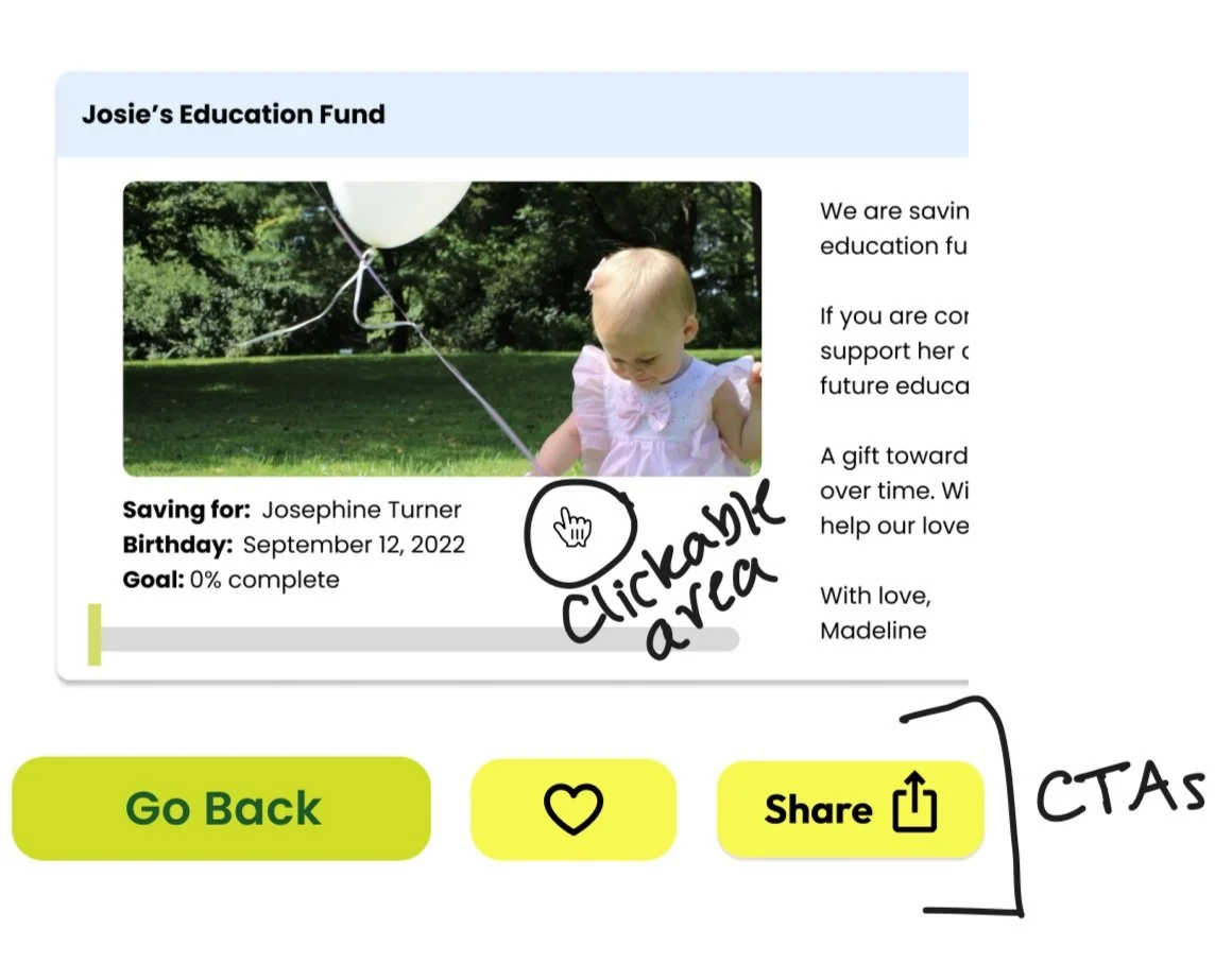
In our exploration of the existing website, both our team and users noticed that interactive elements - including CTAs, clickable areas, and navigation elements - were not always intuitive or functional. Ensuring a seamless experience is crucial for user adoption and retention, particularly when it involves fund transfers.
Who are Pelican’s users?
Affinity Mapping
Personas
Journeys
Meet Sam the Saver
Sam the Saver is a tech-savvy parent or guardian seeking to save for their child's future education. While they have a basic understanding of financial instruments like the 401k, they are eager to learn more about tax-advantaged education savings plans - such as the 529 plan - to become more financially literate. With limited time as a new parent, they value an easy-to-use and straightforward tool.
Users like Sam benefit from contextual coaching and intuitive onboarding.
Sam’s Existing User Journey on Pelican
3 of 4 users sought additional financial context when creating their initial savings goal
3 of 4 users expressed a lack of clarity when setting up a fund in the original flow
Users like Gene struggle with Pelican’s multi-step process for gifting.
Meet Gene the Gifter
Gene the Gifter is a family member or close friend of the Saver's child, driven by the desire to contribute to their loved one's future success. While they traditionally give physical gifts as an expression of love, they are intrigued by the idea of contributing to the child's future through Pelican. They hope for a smooth and secure experience while navigating the platform to ensure their gift reaches the child on time.
Both Sam and Gene are invested in the future of a mutual loved one, and are seeking a more intuitive and secure way to navigate that experience through Pelican.
How might we improve the dashboard experience so that it promotes an efficient and trustworthy experience for accountholders and friends & family who wish to support a child’s education?
So what did we do?
Ideation
Prioritization
Sketching
Wireframing
Prototyping
Onboarding:
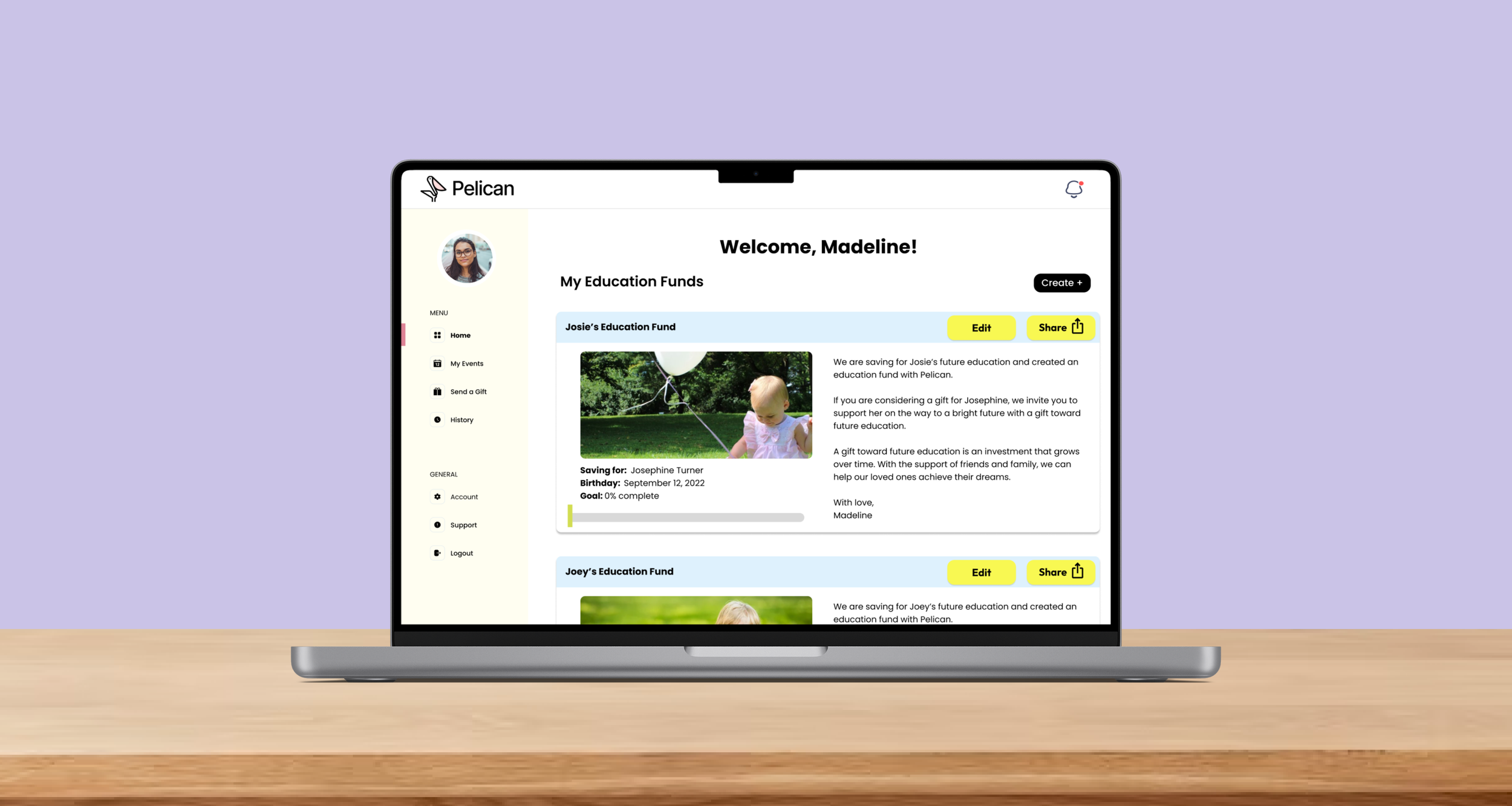
Pelican's Fund Creation functionality is a key feature that enables users to establish educational funds for their children, including a shareable component akin to platforms like Gofundme or Honeyfund. However, users often encountered confusion when starting the fund creation process. To address this, our redesigned new user dashboard prominently displays a clear "Start" button, guiding users and ensuring a smooth experience.
When creating a fund, users can now set a targeted savings goal with improved context. We introduced a personalization option, allowing users to choose between public or private school tuition guidance, which updates the goal-setting slider accordingly. We also included 529-specific information to provide comprehensive tuition guidance.
Previously, newly created funds did not automatically appear on the homepage dashboard, leading to confusion. Our redesign focuses on a single primary fund for each child, ensuring all owned funds are listed on the dashboard, improving user efficiency.
Events Flow:
As aforementioned, users were uncertain about the purpose of funds and their role in milestone events, leading to confusion about whether to create multiple funds or a single fund for their child's college savings. Furthermore, the absence of newly created funds on the homepage and clutter of duplicative funds for the same child in the "Education Funds" tab further complicated the user experience.
Recognizing the need for improvement, we created a completely new “Events” flow to address these issues. Our focus was on enhancing the organization and hierarchy of the site, clearly distinguishing main funds from smaller fundraising events while ensuring the relationship between the two was easily understandable for users.
This clear distinction between main funds and smaller fundraising events proved effective in helping users understand Pelican's use case and make better use of the site's features.
Gifting:
Users had difficulty locating the Gifting functionality. Some users even failed to send gifts, and the majority found the CTAs and site navigation confusing. To address these issues, we implemented a strategy that involved simplifying language and renaming pages and CTAs, using universal icons and indicators consistently, and reducing options to avoid overwhelming users.
To create a more playful and delightful experience, we selected universal and whimsical icons, injecting a lighthearted tone into the process of saving for college. For example, we used a filled heart icon for favoriting instead of the term "unfavorite." Additionally, a confetti animation was incorporated to celebrate the opening of new funds and donations, creating a sense of joy and generosity.
Based on user feedback, we introduced an advanced search feature that allows users to search using multiple attributes for more accurate results. Alternative search fields and fuzzy search were implemented to enhance accuracy. Information hierarchy and interaction were improved by eliminating overlays, addressing scroll issues, and providing individual landing pages for each fund, ensuring clear donation confirmation.
So what’s next?
Recommendations
Next Steps:
Flow Differentiation
The Fund and Event cards still look very similar and should be differentiated visually to help users quickly identify the page or flow they want.
Additional Financial Context
Testers still wanted to access more resources to guide their financial decision making throughout the process, including functional add-ons.
Incremental UI Improvements
There is some remaining confusion around CTAs and cursor hover states - these should be iterated on to ensure maximum conversion and intuition.


